The Kitchen Design Inspiration
At Home with the Hastys - The Kitchen Design Inspiration
The Backstory
New to Hasty Book List? Read about the fire that prompted this home renovation, here.
The Inspiration
While we are waiting for our condo to be completed, I thought I’d share some of the inspiration and design behind the rebuild (plus a few “before” photos.) This is the second “Design Inspiration” post, you can see the Bathroom Design Inspiration here. I want to be super clear about this: I am not a designer. One of my biggest regrets was not hiring a designer to help with this process. It was extremely stressful trying to make sure everything was cohesive and I made mistakes along the way. There are things I would change if I could do it over, things that looked better in my head than they do in real life. Live and learn.
Stay tuned for “after” photos…
At Home with the Hastys - The Kitchen Design
Sources: image One, Two, Three, Four, Five
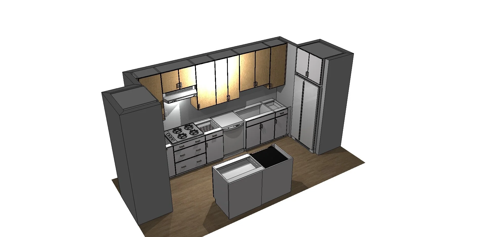
In looking at these inspiration photos, you can see I really like the mix of wood and white when it comes to cabinet materials. We played around with different configurations of where the wood cabinets would be and where the white ones would go before settling with wood for the uppers and white for the lowers. Since we have hardwood floors, I thought this was the best way to separate the two wood tones which wouldn’t match perfectly.
A Peek at the Before…
This “before” photo is from the listing. You might recall that we only lived in our condo for two days before the fire occurred so there was no time for us to take photos of the way we had it set up. We were still in the process of unpacking! Eric loved that the oven was built-in and off the ground (tall people problems.) I’m sure that is what sold him on the place. In hindsight, it is funny that the one thing that sold him on the condo is the thing that malfunctioned (in the unit below ours) causing us to lose it in a fire. But I digress…
At Home with the Hastys - The Kitchen Design “Before”
The Renderings
At Home with the Hastys - The Kitchen Design
We worked with Marcin Popowski, Senior Cabinetry Designer at MONTEDOR, INC. in Mount Prospect, IL. He was great to work with, very particular about measurements (a MUST!) and asked a lot of questions to determine our needs and wants for the kitchen. He made suggestions when we were stuck but wasn’t pushy. I would definitely work with him again (he also did our custom vanity for the two bathrooms.)
We kept the layout exactly the same, with only a few minor changes to the cabinets. We added two small cabinets above the vent and we selected shorter cabinets above the sink in order to allow for a taller kitchen faucet and extra backsplash. We widened the opening for the refrigerator to accommodate a wider appliance with more cubic feet and we added a beverage center because we still couldn’t squeeze in a very large refrigerator (besides, who doesn’t love a beverage center?!)
The Materials
This is an incomplete list of the materials we’ve selected. We still have a few things to pick out, including a shower door.
Upper Cabinets
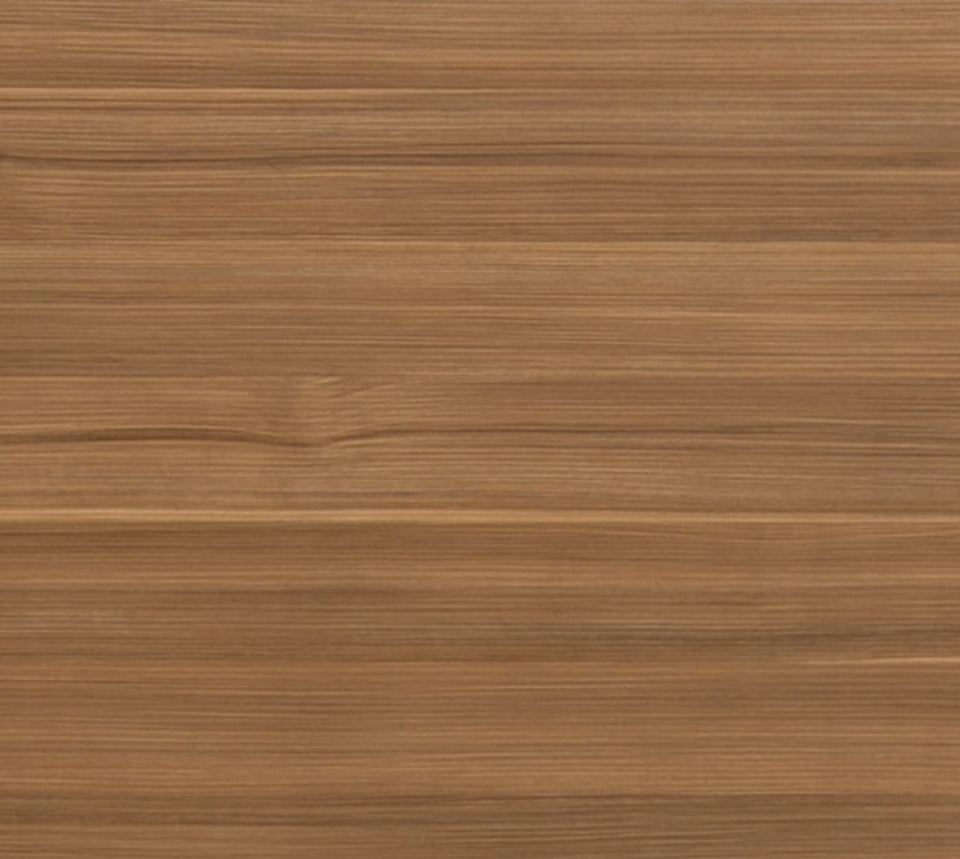
Arizona Cypress from Eclipse Cabinetry
Lower Cabinets
Matte White from Eclipse Cabinetry
The wood sample is the exact same material that is pictured in the first inspiration image above, to give you an idea of what it will look like in an actual kitchen. It is also the same material we chose to use for the bathroom vanities. As you know, my husband and I are not designers and our biggest concern was that we would choose all these separate parts and they wouldn’t come together to form a cohesive look. So any time we could use the same materials for something, we did!
Shop other options…
Backsplash
Festival
Black Matte 2 in. Hexagon Porcelain Mosaic
You might notice that the backsplash is the same tile we used for the bathroom floors. Again, this was in an effort to make everything appear cohesive. If we had hired a professional interior designer, I think we would have taken more risks and added more variety in the materials we selected. But this is not going to be our forever home…this is our starter home, the first we ever owned. So although our stamp is on everything, we wanted it to have great resale value too.
Shop other options…
The Sink
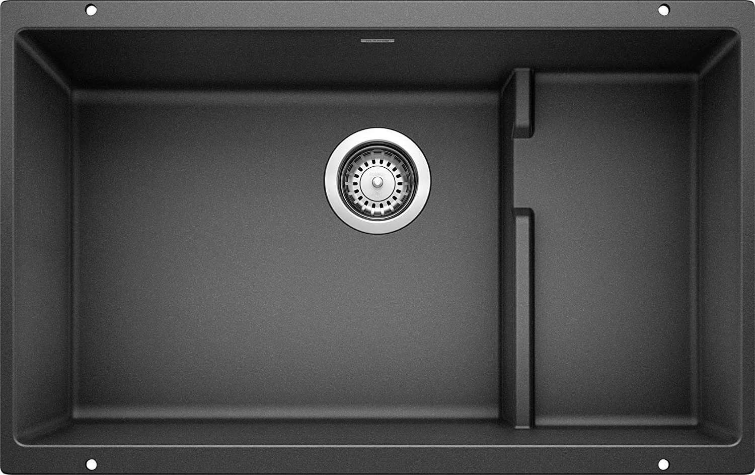
Blanco Precis Cascade
Isn’t this sink gorgeous? Eric discovered Blanco sinks while searching for granite composite sinks. We knew we didn’t want a stainless steel sink, granite sinks were a bit out of our budget, and we weren’t sold on porcelain sinks due their susceptibility to chips and tendency to stain. I love all the angles of the sink which coordinate well with the angular doors and molding we chose. I can’t wait to see this sink installed.
Shop other options…
The Faucet
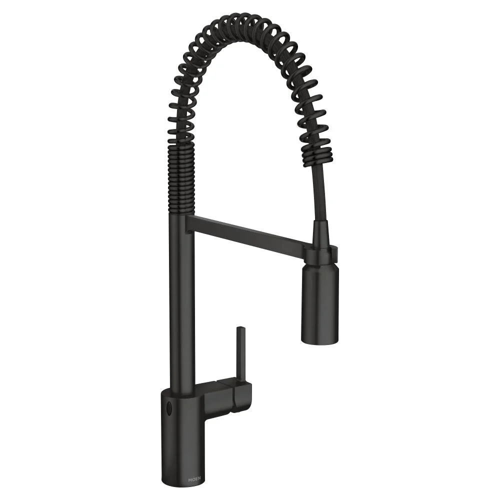
Moen Align Touchless Single-Handle Pull-Down Sprayer
In a series of Instagram Q&As about our selections for the condo, someone asked what we are splurging on. This is definitely one of the splurges. Eric found and fell in love with this kitchen faucet. He had his heart set on it from day one. Despite my best efforts to get him to agree to a similar one for a fraction of the cost, he wouldn’t budge. This was his thing. He compromised in other areas but when it came to the kitchen faucet, he knew what he wanted.
Shop other options…
Pulls
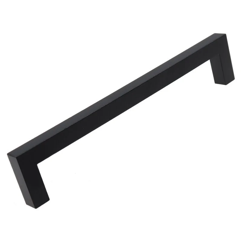
Center Bar Pull by GlideRite Hardware
You guessed it! These are the same pulls from the bathroom vanities…and they’ll be the same pulls from the custom closets (more on that later.) This is an area where we chose to save money. Our kitchen designer suggested a more expensive option but we liked these just as much, if not a little better, than the designer option.
Shop other options…
Glass Rinser
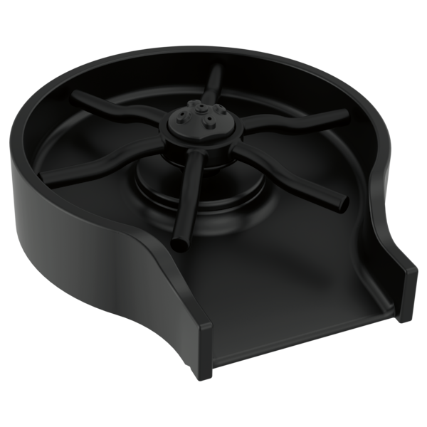
Metal Glass Rinser in Matte Black by Delta
It is the little things and small luxuries that I’m most looking forward to when we’re back in our condo. Including this matte black glass rinser from Delta. Washing dishes is one of my least favorite chores…so why not splurge on a gadget that will make dishwashing a little more fun? I’ll never be able to toss liquor bottles or shake up a cocktail like my favorite bartenders, but I can clean a glass like them. Ha!
Shop other options…
Countertops
Carrara Lumos
One of the sub-contractors suggested we go to Luxury Marble and Granite Design Inc. (a Chicago place) to pick out our countertops. Some of our neighbors went to a different place suggested by our general contractor and eight weeks later (and two weeks after they moved in) they are still waiting for their countertops to arrive. Other neighbors who went with the local place, got theirs in a week. We are not to the stage where we are ready for countertops, but I think our chances are better with Luxury Marble and Granite Design.
Other Kitchen Features:
Paint
Chantilly Lace
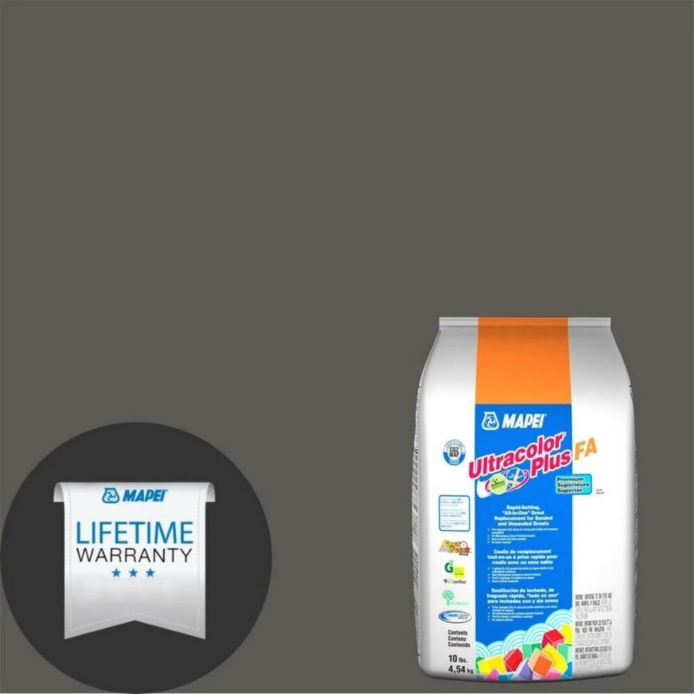
Grout for the Backsplash
Mapei 47 Charcoal Ultracolor Plus FA Grout
