The Bathroom Design Inspiration
At Home with the Hastys - The Bathroom Design Inspiration
The Backstory
New to Hasty Book List? Read about the fire that prompted this home renovation, here.
The Inspiration
While we are waiting for our condo to be completed, I thought I’d share some of the inspiration and design behind the rebuild (plus a few “before” photos.) I want to be super clear about this: I am not a designer. One of my biggest regrets was not hiring a designer to help with this process. It was extremely stressful trying to make sure everything was cohesive and I made mistakes along the way. There are things I would change if I could do it over, things that looked better in my head than they do in real life. Live and learn.
Stay tuned for “after” photos…
At Home with the Hastys - The Bathroom Design
Sources: image One, Two, Three, Four, Five
We were inspired by black and white bathrooms with warm wood accents. We considered a variety of tiles, all some combination of black and white. My original thought was to use the small hexagon tile on the floors and subway tile on the walls as a nod to the building’s history. We kept the hexagon shape for the floors but chose a larger version to make it a bit more contemporary. For the walls, we chose large-format tile as a way to save money on materials and labor. By requesting minimal grout, it almost looks like a single slab and grout can get kind of gross in bathrooms so I didn’t want a lot of it to scrub and keep clean.
A Peek at the Before…
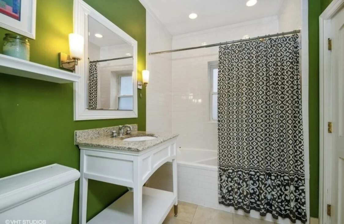
These pictures are from the listing. All of the “before” pictures will be from the listing because we didn’t take any photos of the place after it was painted and we’d moved in (we only lived there for two days before the fire.) This bathroom was nearly a deal-breaker for me. The other property we were interested in had a bigger and better designed en suite leaving me feeling very “meh” about this one. There were three things I hated:
At Home with the Hastys - The Bathroom Design “Before”
The green paint on the walls made my skin look green (we agreed the entire place needed to be painted before we moved in.)
The lack of storage in the vanity. Where was all of our stuff going to go? There is virtually no countertop space and there is no storage beneath the sink…just open space!
It wasn’t a proper en suite. It had a door into the master bedroom and a door to the hallway.
At Home with the Hastys - The Bathroom Design “Before”
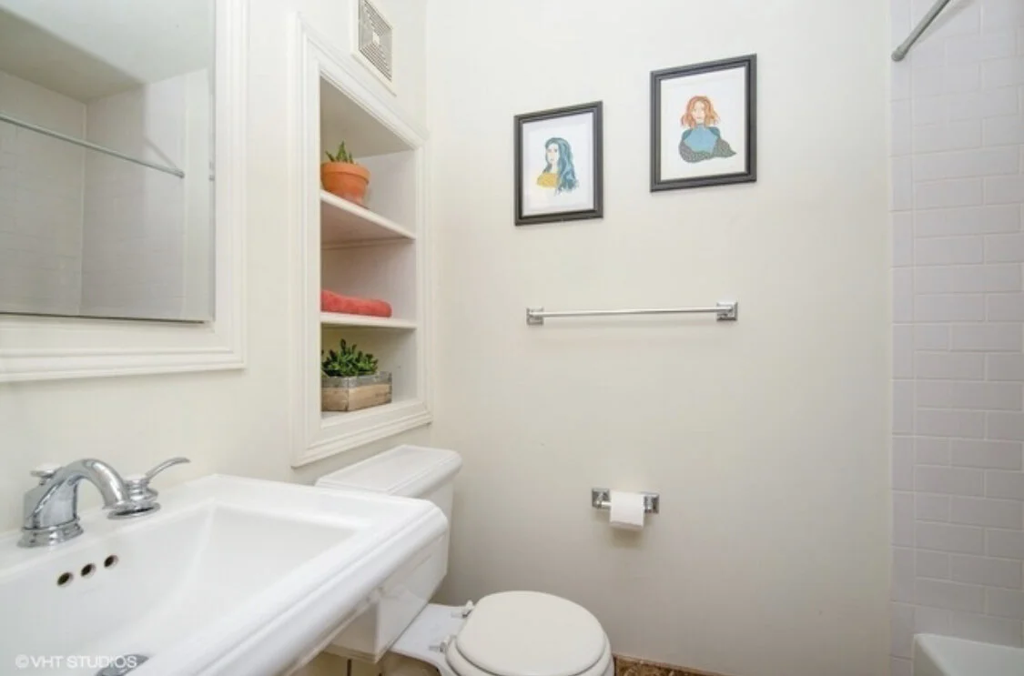
The second bathroom wasn’t bad. It had a cute pedestal sink, a medicine cabinet, and I decorated those shelves with a glass box filled with bath bombs, neatly rolled towels, and baskets of bathroom essentials for our guests. We wanted to replace the beige tile eventually, but it was neutral enough that it wasn’t a super high priority.
The Renderings
At Home with the Hastys - The Bathroom Design
My husband, Eric, actually came up with the new layout. We closed off the door that led to the hallway making it a proper en suite. On the wall where the door used to be, we designed a custom vanity with the same guy who designed our kitchen cabinets. Look at all that storage and all of that counter space! To the left of the vanity, there used to be a small linen closet. We tore that out to expand our countertop space and added the upper cabinet for more storage.
We moved the toilet to the center of the bathroom. On the opposite side of the bathroom, we tore out the jetted tub that was no longer functional and put in a walk-in shower with a custom sliding door.
The Materials
This is an incomplete list of the materials we’ve selected. We still have a few things to pick out, including a shower door.
Vanity Cabinet
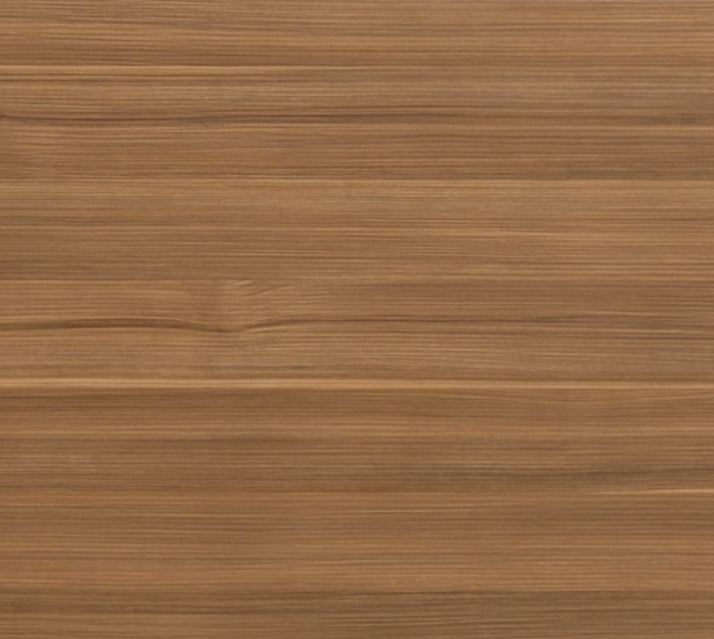
Arizona Cypress from Eclipse Cabinetry
The bathroom vanity is made out of the same material as our kitchen cabinets. We had so many decisions to make for this rebuild that we were getting overwhelmed. So anytime we could say, “let’s use the same material as…” we did! The guy who designed our kitchen cabinets also designed the custom bathroom vanity. He was fantastic to work with.
Shop other options…
Floors
Festival
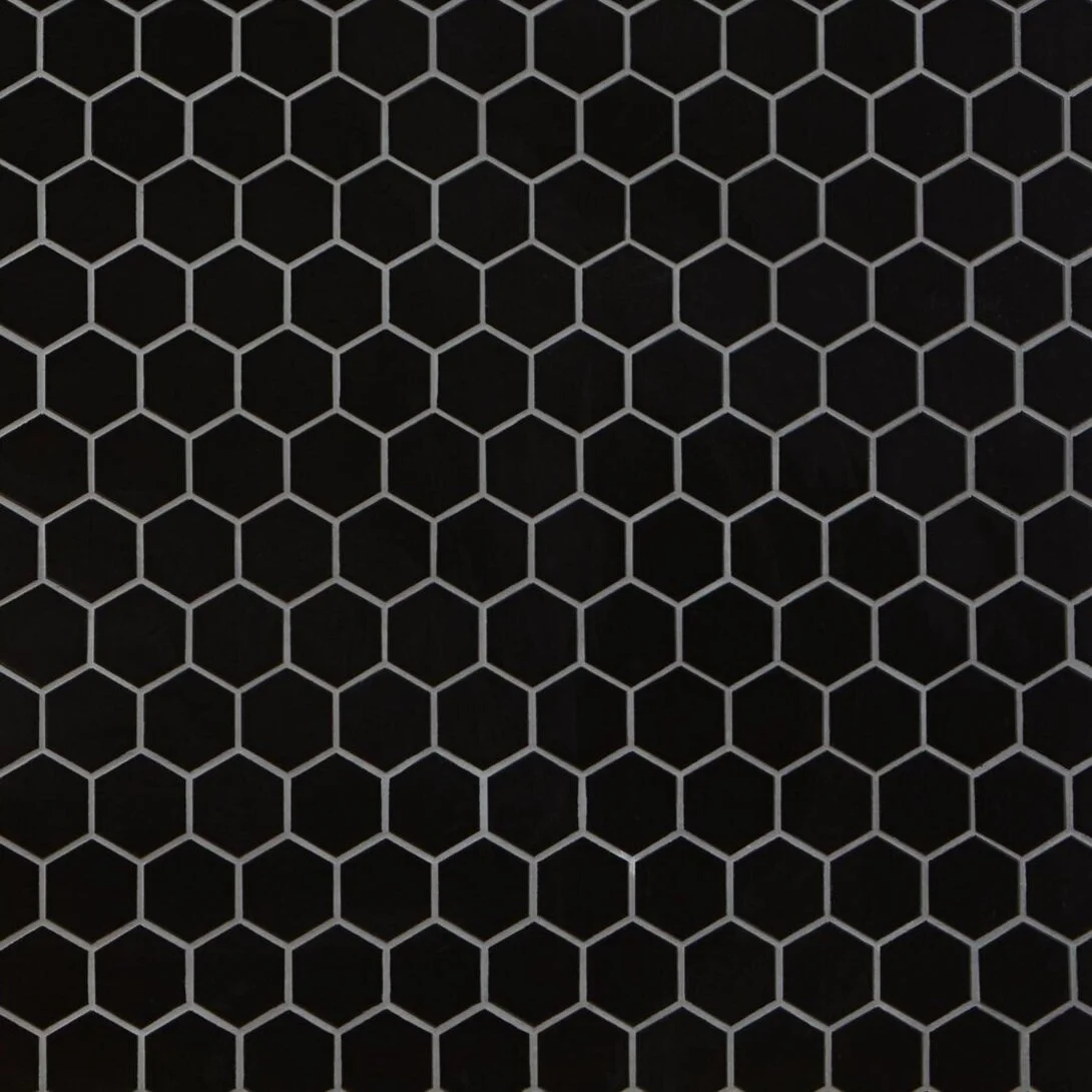
Black Matte 2 in. Hexagon Porcelain Mosaic
There was no getting around that everything would be new in the condo. It was all destroyed, it all had to be gutted. So I made an effort to add some “old” materials or at least a nod to history in some of my design choices. One example of this is the classic black mosaic tile.
Shop other options…
Shower Walls
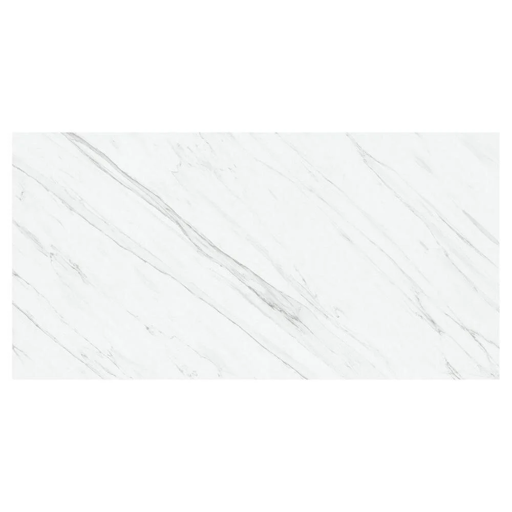
Maximo Vanglih Polished Porcelain Tile
It would have been great if we had it in the budget to choose a slab of marble or granite for the shower walls. But we had a very limited budget. One of the ways we chose to save money was to use the relatively inexpensive “large format” tile. It has a similar look to a slab of marble but a fraction of the cost. We asked the tile guys to use minimal grout lines so that it would almost have the same look as a slab.
Shop other options…
The Fixtures
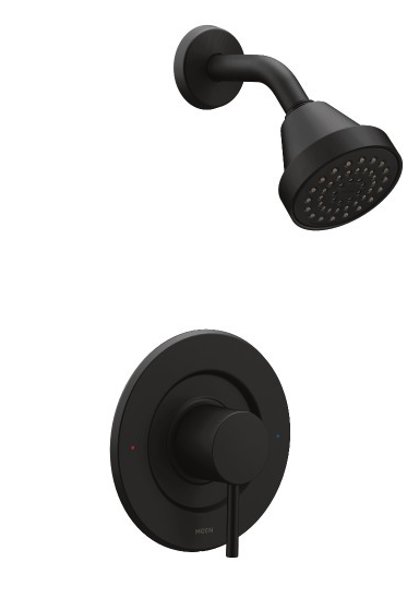
Moen Arlys in Matte Black
Eric had selected some super expensive bathroom fixtures…like double (or maybe even triple) the budget we got from insurance. We compromised on these…which were still a bit over budget but much more reasonable. Honestly, I can barely tell the difference between these and the luxury ones Eric chose (I’m sure a designer would disagree with me…that is the benefit of not knowing anything about interior design. In some instances ignorance = bliss.)
Shop other options…
The Faucet
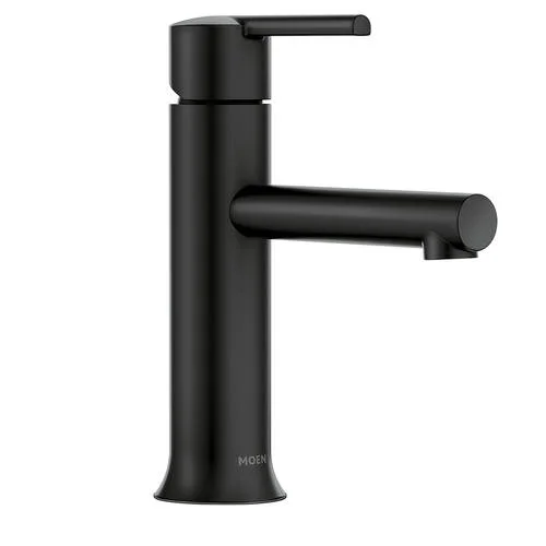
Moen Arlys in Matte Black
The same story as the shower fixture applies for the faucet. Eric found an expensive one - I found a slightly less expensive one with a similar look. And in case you’re curious, he wanted the Moen Align collection - in case you do have it in your budget to get a super nice bathroom fixture.
Shop other options…
Pulls
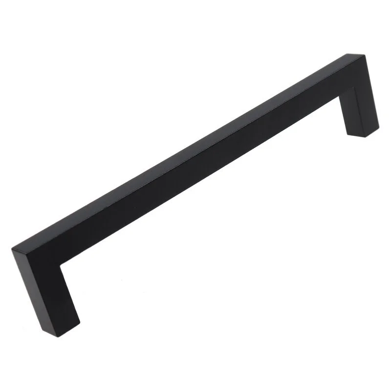
Center Bar Pull by GlideRite Hardware
I learned so much about cabinet pulls during this process. This is something I never thought about prior to the fire. We always rented so we got the cabinet pulls we got and I never thought twice about it. But I started noticing that my pockets (and hair dryer cords) would catch on the cabinet pulls in our temporary apartment. So the one thing I stipulated for our new cabinet pulls was that they not have “hooks” on the end.
Shop other options…
Bathroom Mirror
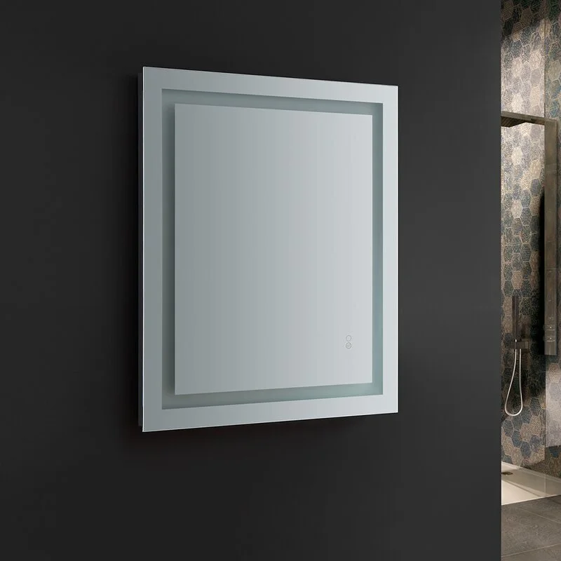
Santo Bathroom Mirror with LED Lighting and Defogger
Eric wanted a hotel bathroom feel in the master bathroom…and the number one thing almost all hotels have (at least the ones he stays in for work?) LED-lit mirrors. This was a must-have for Eric. And dang, they can be expensive. We made this selection toward the end of our decision-making phase and we were getting really burnt out. We actually got some help from our contractor who hired someone to source materials for us. I may regret going with a budget option on this…we’ll see.
Shop other options…
Toilet
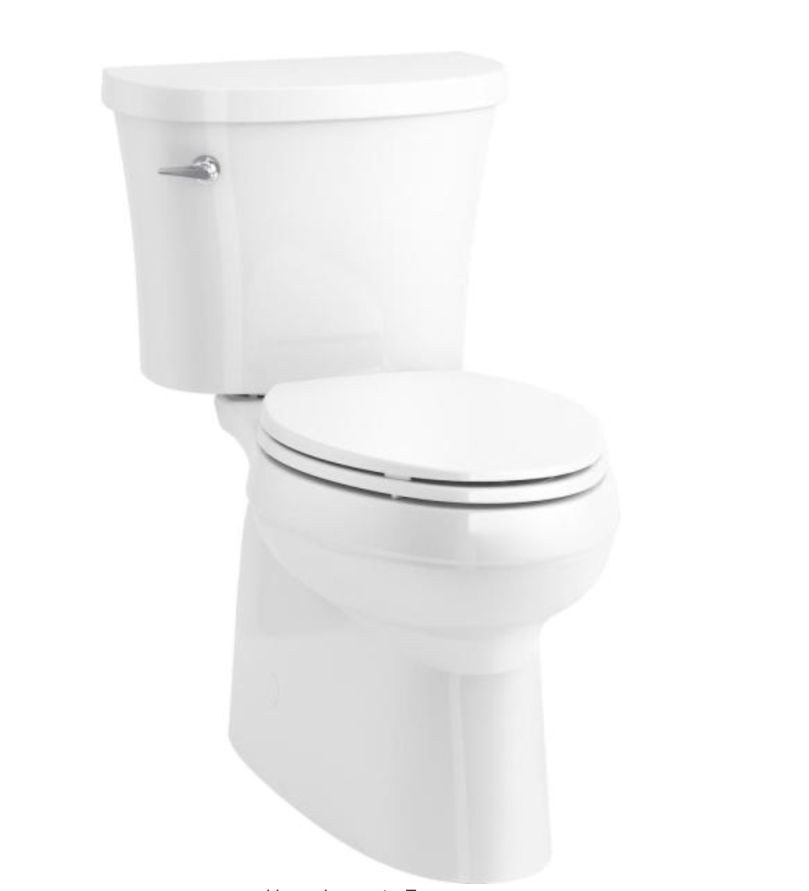
Gleam 2-Piece Chair Height Elongated Skirted 1.28 GPF Single Flush Toilet in White with Slow Close Seat
Talk about things I never thought about prior to the fire. There are a million toilet design options. When our contractor told us we needed to choose one I was like, “what is there to choose?” As with most things, I wanted the simplest possible design. The contractor said most people don’t want the pipes to be visible because they collect dust. And most people want a single piece for the same reason (we got a two-piece because it was less expensive and I figured I’d just be sure to clean it.)
Shop other options…
Bathroom Accessories
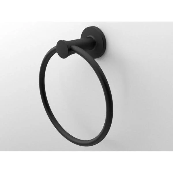
Glacier Bay: Lucien Collection
This was at the very end of our decision-making process and I have to be honest, the contractor found these for us, said they were similar to our aesthetic, and we said, “yeah, sure.” Analysis paralysis is a real thing. Looking back on them now, she was right…they do look good with the other matte black options we included in our bathroom design. The one stipulation Eric had was that he wanted an “open-ended” toilet roll holder. He doesn’t like the ones that have a spring and two anchors.
Shop the collection…
Countertops
Carrara Lumos
One of the sub-contractors suggested we go to Luxury Marble and Granite Design Inc. (a Chicago place) to pick out our countertops. Some of our neighbors went to a different place suggested by our general contractor and eight weeks later they are still waiting for their countertops to arrive. Other neighbors who went with the local place, got theirs in a week. We are not to the stage where we are ready for countertops, but I think our chances are better with Luxury Marble and Granite Design.
Other Bathroom Features:
Paint
Chantilly Lace
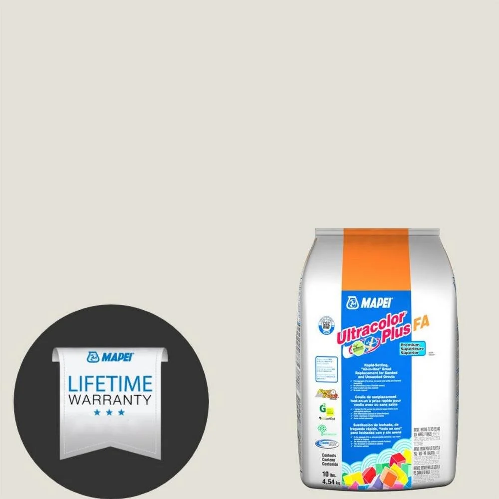
Grout for the Walls
Mapei 00 White Ultracolor Plus FA Grout
Grout for the Floors
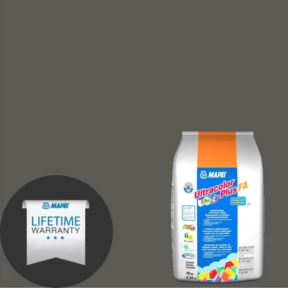
Mapei 47 Charcoal Ultracolor Plus FA Grout
