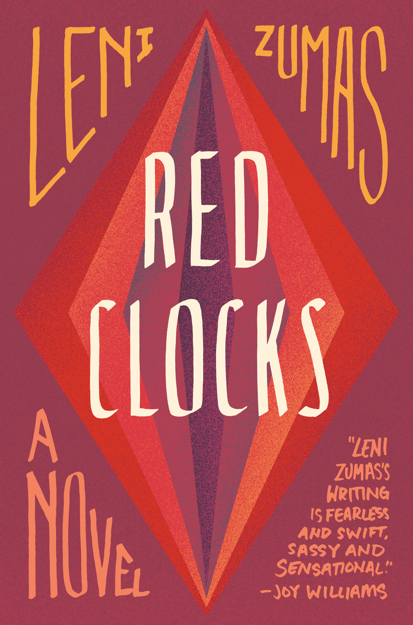
Book Jacket Designs by Lauren Harms
Judge a Book By Its Cover - Book Jacket Designs by Lauren Harms:
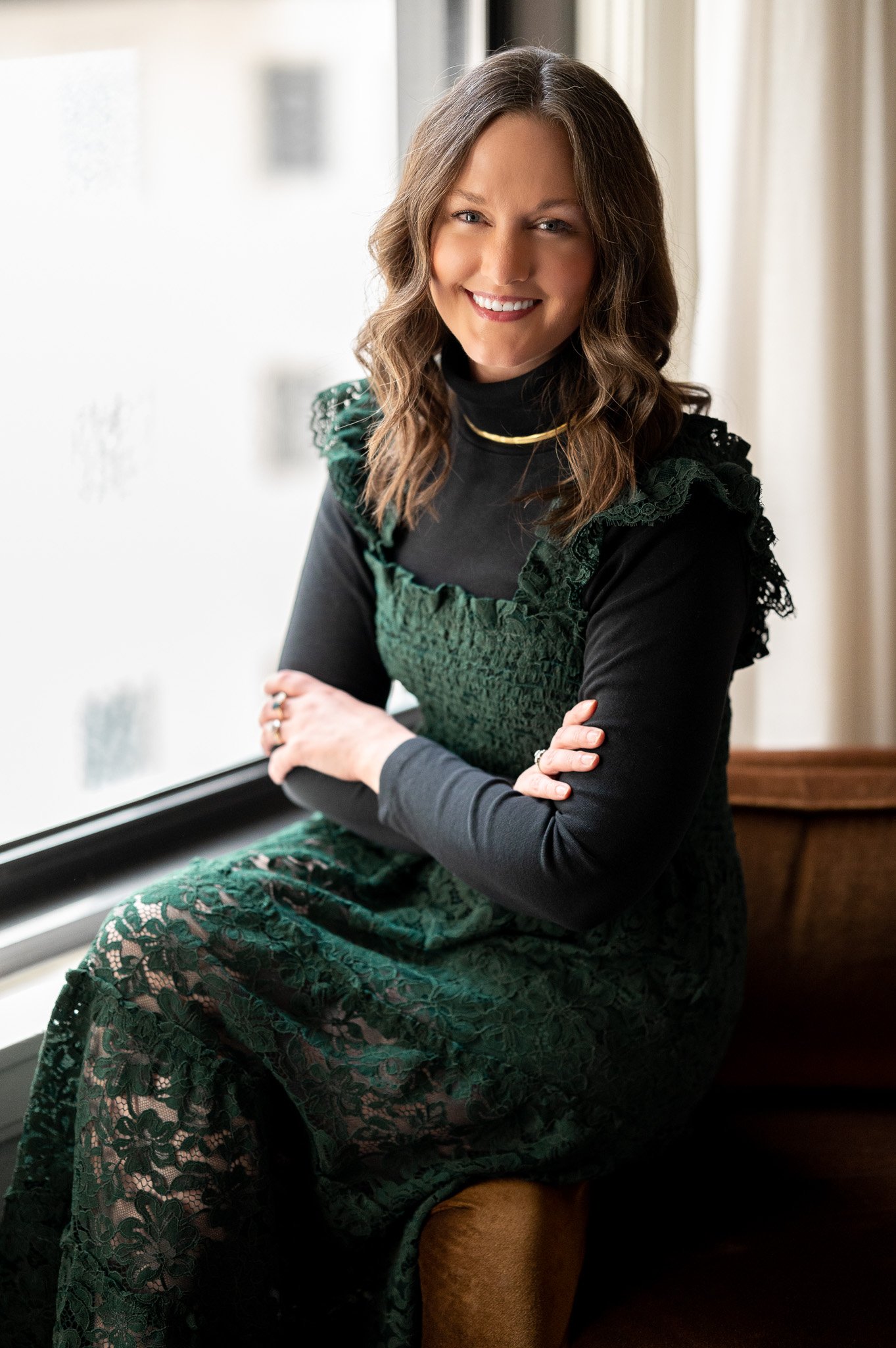
I am an Art Director at Little, Brown and Co., an imprint of Hachette Book Group. Before Little, Brown, I was at St. Martin's Press/Macmillan. I'm a graphic designer that fell into book publishing. I graduated from Syracuse University with a degree in Communications Design. After graduating, I had a few different intern and temp positions in branding and marketing. While the work was fine and I was happy to be using my degree, I wasn't super excited about the projects. An art director at HarperCollins somehow got my name and asked me to come in and interview. Our conversation was incredible, and I was completely taken with the process of designing a book cover. I love the research that goes into each cover - whether it's reading the manuscript for tone, or studying a specific time period to represent accurately.
What I love about the Little, Brown list is how varied it is. I get to work on many different and equally fascinating books - from compelling fiction to cookbooks by culinary legends. Every day is different.
Judge a Book By Its Cover - Book Jacket Designs by Lauren Harms
Inspiration for What Happens in Paradise by Elin Hilderbrand:
I've worked on Elin Hilderbrand's books for a few years now, starting with the Winter Street series that debuted in 2014. That series was her break into publishing winter books, as her books are usually on sale and set in the summertime. The new series was an exciting opportunity to create a more gifty package for the holidays, and break away from the beach scenes that are on most of her covers. When the Winter Street series ended, we were really excited for her to start a new winter trilogy - the Paradise Series. These would still go on sale around the holidays and be set in winter, but we would be back on the beach. This time in St. John, USVI!
In developing these series looks, I like to think my education in branding plays a part. When I started thinking of design concepts for the new book, there were a few elements I wanted to include to build a series look. The hand painted border gives it the gifty feel we wanted to keep from the Winter Street books. The script title type is different from Elin's other books and has a fun feel that lends itself to the vacation setting. And of course we wanted a bright and beautiful photo of a Caribbean beach, to whisk the reader away. These elements come together to give this series a unique look that really stands out and looks cohesive.
So far for the series, we've chosen images that feature one woman. I think this is because the books really center around the main character, Irene, and how she handles discovering of her husband's secret.
Judge a Book By Its Cover - Book Jacket Designs by Lauren Harms
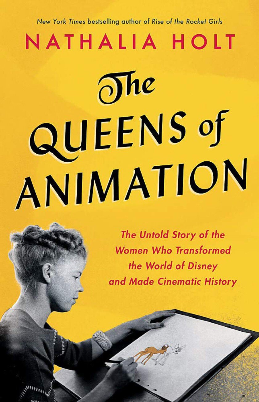
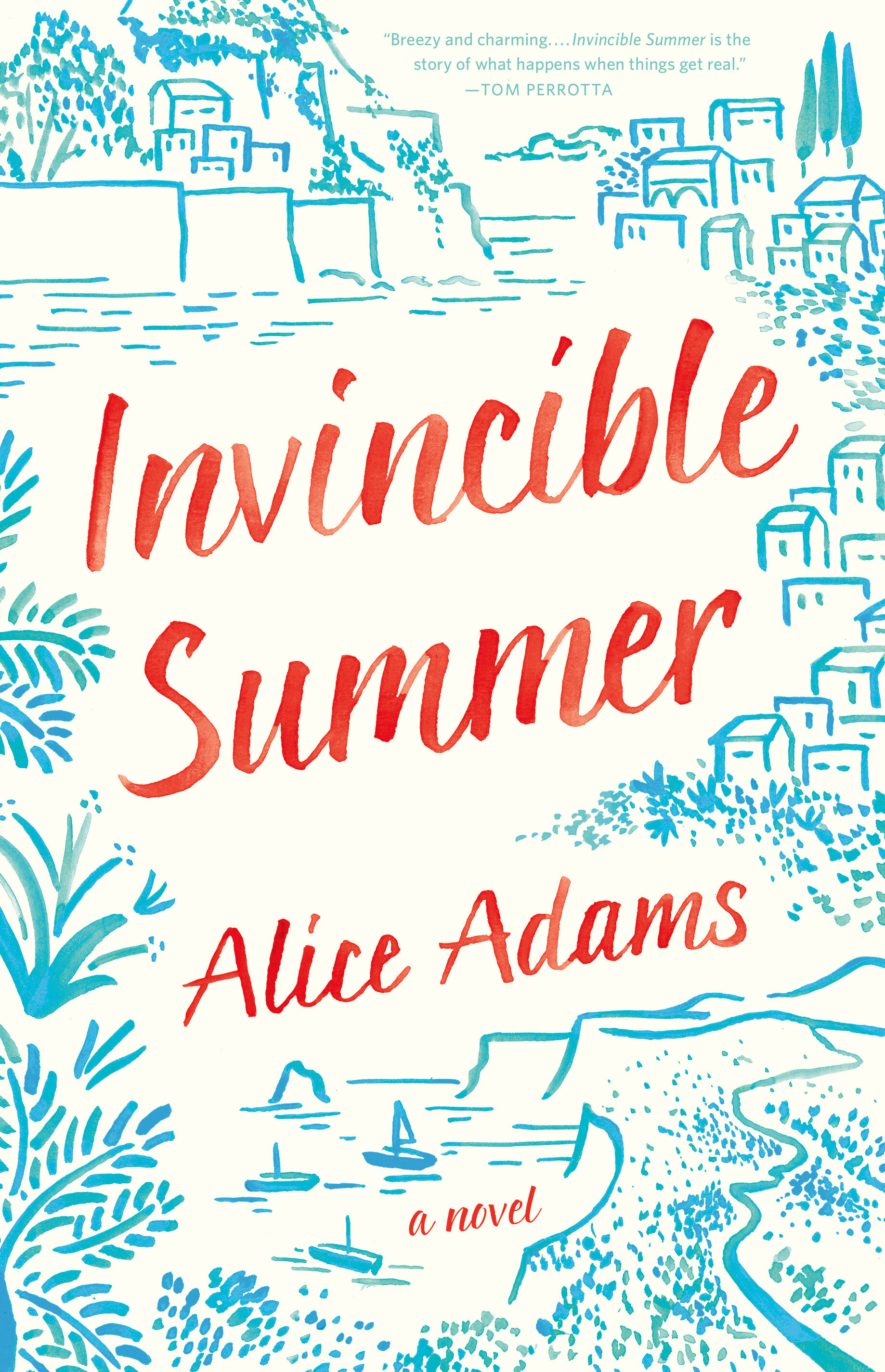
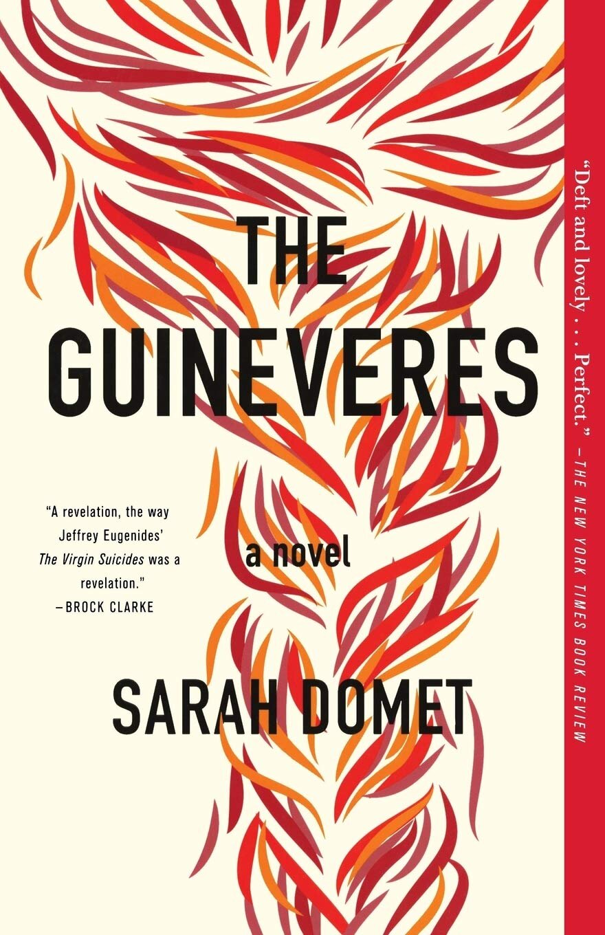
Other book jackets by Lauren Harms:
Judge a Book By Its Cover - Book Jacket Designs by Lauren Harms
Judge a Book By Its Cover - Book Jacket Designs by Lauren Harms
Judge a Book By Its Cover - Book Jacket Designs by Lauren Harms
