Book Jacket Designs by Karen Horton
Judge a Book by Its Cover - Featuring Designs by Karen Horton
Bio:
Karen Horton is currently the Associate Art Director at Henry Holt & Company, an imprint of Macmillan Publishers. She’s been working in the book publishing industry for almost 15 years. Born and raised in Miami, Florida, Karen moved to NYC immediately following graduating from the University of Florida with a BFA in Graphic Design back in 2003. She has previously worked at St. Martin’s Press, The Children’s Museum of Manhattan, Oxford University Press, Little, Brown and Company/Hachette, and Flatiron Books. For years in the after-hours, Karen was also co-founder and Editorial and Social Media Director for the start up design community and brand, design:related. The passion project launched more than a decade ago and had a good run until sadly folding in 2014. Her first job in the book publishing industry was at St. Martin’s Press. After a broad range of experiences elsewhere, she was happy to return to the Macmillan family in 2014 to work for the then brand new imprint, Flatiron Books. In May 2016, she moved upstairs to join the Henry Holt & Company team.

Inspiration for the book jacket of Goodbye, Vitamin:
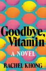
Goodbye, Vitamin was the first fiction title I had the opportunity to design when I started working at Henry Holt. If there is something to read, especially for a novel, I start there. That's often where the inspiration sprouts. When I began the process for designing the jacket of Goodbye, Vitamin, luckily there was a full manuscript available. And I devoured it in one sitting—that is rare. I was surprised that a novel about a 30-yr old woman returning home following a breakup to help care for her father who is starting to show signs of Alzheimer’s could feel both funny and tender. It was such an enjoyable reading experience and it’s difficult to put into words way this particular story resonated with me so well. One might expect a sorrowful novel that is painful to get through given the tough subject matter. But the beautiful prose seems to focus on what is in the present and once remembered, rather than focusing on what is forgotten. Sprinkled throughout the book, are conversations between the main character, Ruth, and her dad. What makes this book special are the excerpts interwoven from an old notebook. The prose addresses with ease our perceptions of memory, and the associations one makes between what is seen, heard, and tasted. There are many other visual directions this jacket could've gone in (and we did try)—but doing something with food was always in the back of mind. Early on I tried designs working with the shape of a Ginkgo leaf—it was a natural starting point given its presumed effectiveness for memory and the main character’s attempts at making changes in the kitchen to offset further cognitive decline of her dad. Another idea I explored was making the jacket out of squares with everyday items, reminiscent of the childhood Memory word card game. But as it often is, images can be loaded with other connotations—and it was only those who read the initial draft that got the references.
Arriving at the final solution with the multi-colored lemons felt like a natural evolution of the feedback from editors and the author along the way. I recall an early suggestion from the author to create a wallpaper for the background. This comment might’ve subconsciously led me to handle the lemons in an unexpected way. Food and word puns are a thread through the novel and is a way in which the main character, Ruth, is able to reconnect with her dad. I liked the idea of the same image triggering different associations or memories in the reader’s brain. And then what happens to your perception of the same image when it is repeated and the color is altered. When I started to hear a flurry of confusion as to what the imagery was and why it was used (such as, “Are they lemons, limes or oranges, or are they eggs or nipples?”) it further reiterated why the end solution was appropriate. Was my initial intention to play off of the idiom “When life gives you lemons, make lemonade”? No, but I don’t mind if that’s the reader’s takeaway from the jacket design.
Somewhere down the road, rather late in the process, there was side feedback that this is a woman’s story, and for that to be evident to the viewer we would need to show a figure or human element on the jacket. By some miracle, this didn’t end up in the bookstores with a jacket featuring the back of a beautiful woman. But that almost happened, so to have such a colorful fruit pattern on the book jacket for a work of debut fiction, sans female figure, feels like a small victory.

Examples of her art work:
I don’t consider myself an artist, though I’m told that I am one often. Some of my photo’s are taken with a discerning design eye (https://www.instagram.com/karenhorton/). But, sadly I haven’t created art only for art’s sake since college. But I’m an observer and collector of design ephemera and have been sharing my various research and finds in the online space for a very long time. Every so often I dabble in collage using snippets from vintage magazines and ephemera in my collection. I’ve attached two pieces here if you wish to include.


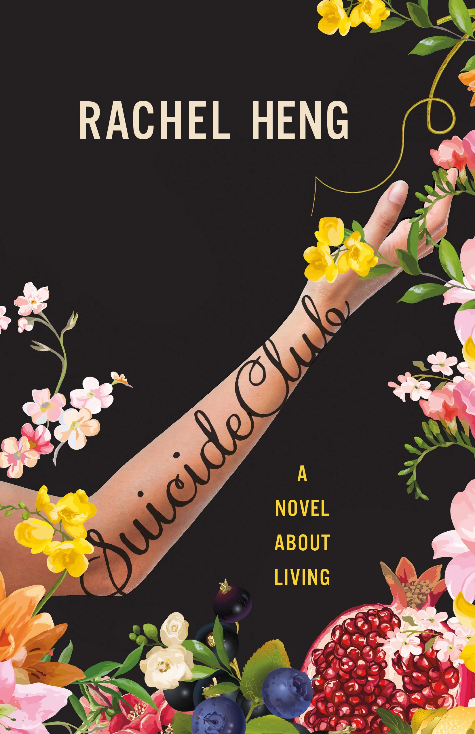
Three other book covers she's designed:
Included one old (Private— designed back when I was Art Director for James Patterson) and two for books pubbing later this year, Robin and Suicide Club)