

Creating a Color Palette for Your Author Brand
Choosing the Perfect Color Palette for Your Author Brand
As an author, your brand is more than just your name and the books you write—it’s the overall impression you give to your readers. One of the most powerful ways to shape that impression is through color. Whether it's the hues on your book covers, your website, or social media profiles, the right color palette can evoke specific emotions, reinforce your genre, and make your author brand instantly recognizable.
Let’s dive into how to choose the right colors for your author brand, how to use them consistently, and the psychology behind those color choices.
The Power of Color: Why It Matters for Your Author Brand
Colors have an incredible ability to evoke emotions and associations, making them one of the most crucial elements of your brand. Different shades can signal excitement, calmness, trust, or mystery, depending on how they’re used. As an author, it’s essential to choose colors that align with your writing style, genre, and the emotions you want your readers to feel when they engage with your work.
Palette: Reflect the Tone of Your Writing
One of the first things to consider when building your author brand is selecting a color palette that reflects the tone of your writing. Whether you're a romance novelist or a thriller writer, your chosen colors should reflect the mood of your stories.
Romance Authors: Soft pastels like blush pinks, lavender, and warm corals might be the perfect palette for you. These colors evoke feelings of warmth, love, and tenderness, mirroring the themes of your novels.
Mystery/Thriller Writers: If you write mysteries or thrillers, you might opt for dark, bold colors like navy blue, deep crimson, and charcoal gray. These tones evoke suspense, danger, and intrigue.
Fantasy Writers: A fantasy author could use colors like emerald green, royal purple, and gold to evoke magical, mystical worlds filled with adventure.
Science Fiction Authors: Bright, futuristic shades like electric blue and neon green would align with themes of technology and otherworldly exploration.
Historical Fiction Writers: For historical fiction, muted, vintage-inspired colors such as burgundy, sepia, and ivory can help evoke a sense of history and tradition.
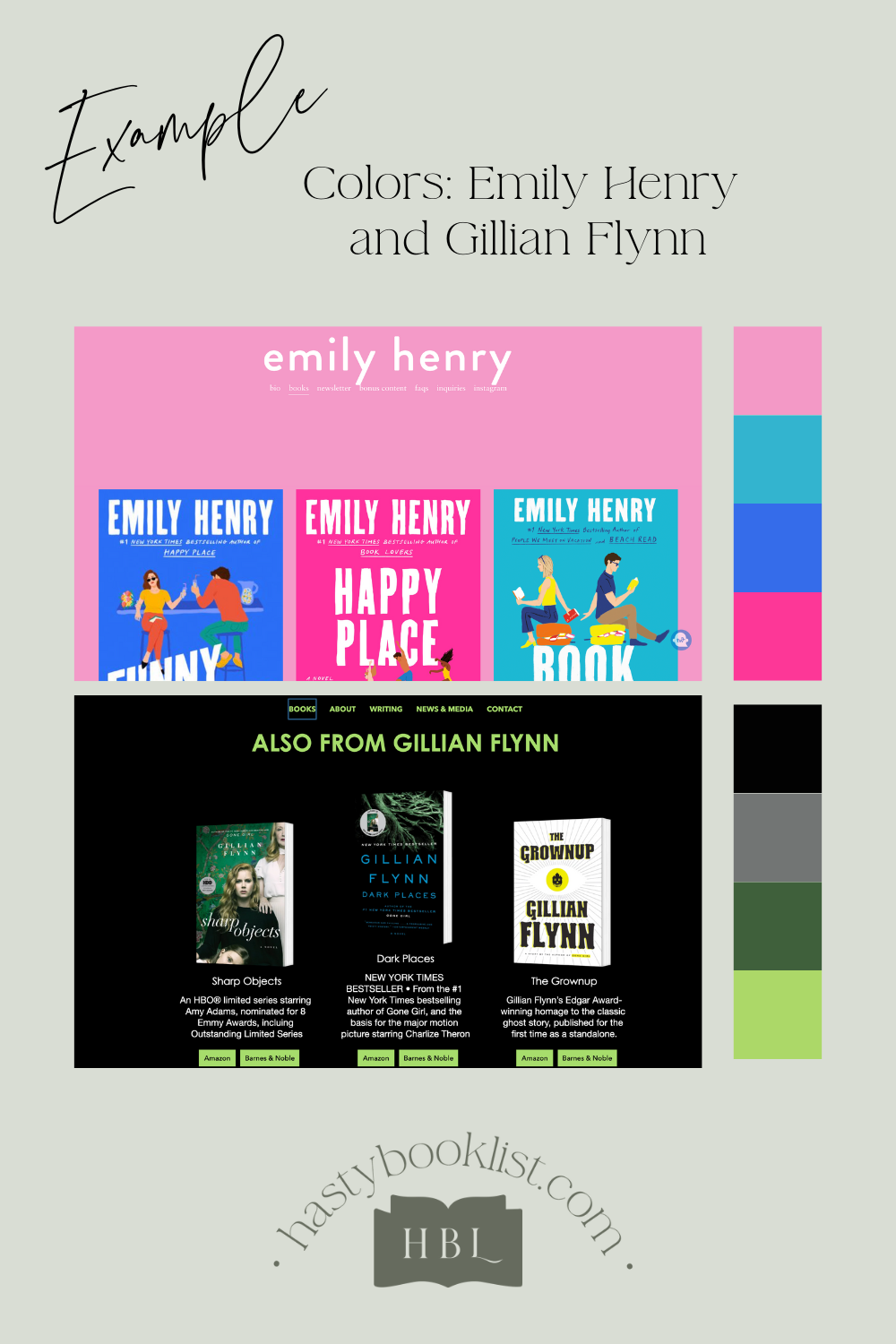
By choosing a palette that aligns with your genre and tone, you not only set the stage for the kind of stories you write but also create a cohesive visual identity that readers will come to recognize.

Consistency: Building a Cohesive Visual Identity
Once you’ve chosen the colors that reflect your writing, it’s essential to use them consistently across all platforms. Your author website, social media profiles, book covers, and marketing materials should all reflect your brand colors.
Imagine a reader visiting your website after reading one of your books. If they see the same color scheme on your site that was featured on your book cover, it creates a seamless and professional experience. Consistency builds trust and recognition—two essential components of a strong author brand.
Use your palette as the foundation for everything from your logo and website design to your promotional materials like bookmarks and business cards. This consistent application of color helps create a unified, memorable presence across the web and in the minds of your readers.

The Psychology of Color: What Your Palette Says About You
Beyond aesthetics, colors carry psychological weight. Certain colors evoke specific feelings, and by understanding the psychology of color, you can choose a palette that conveys the right message to your readers.
Here are a few examples of common color associations:
Blue: Often associated with trust, serenity, and professionalism. If you want to convey a sense of calm and reliability, blue is a solid choice. It’s perfect for non-fiction authors who write self-help or inspirational books.
Red: A passionate and exciting color that demands attention. Red works well for genres filled with action or drama, like romance or thrillers. It can create an urgent, heart-racing sensation.
Green: Evokes feelings of nature, growth, and balance. Green can work for authors of fantasy novels, environmental non-fiction, or even literary fiction that explores themes of renewal and hope.
Yellow: Bright, cheerful, and optimistic, yellow can signal joy and energy. This color might be a great fit for children’s book authors or anyone who writes lighthearted, uplifting stories.
Purple: Traditionally associated with royalty, mystery, and magic. Purple can add a sense of grandeur to fantasy novels or lend a luxurious touch to historical fiction.
Black: Represents sophistication, elegance, or even mystery. Black is often used in the thriller genre or for any author who wants to convey authority and professionalism.
Understanding how different colors make people feel helps ensure that you are conveying the right emotional message to your readers. For example, if your books are action-packed with lots of tension, using softer tones like pastel pinks and blues might give the wrong impression.
Color Is Your Brand’s Secret Weapon
In the competitive world of publishing, creating a strong and cohesive author brand is essential. Your color palette is one of the most powerful tools you have to communicate your brand’s identity and connect emotionally with your readers. Whether you’re a publishing author or just starting your journey, using colors that reflect the tone of your writing, applying them consistently, and understanding the psychology behind them can elevate your brand and make your work instantly recognizable.
By mastering the art of color selection, you’ll not only enhance your book cover designs and marketing materials but also create a deeper connection with your readers, ensuring they recognize your brand no matter where they see it.

Sample Color Palettes by Genre
Here are sample color palettes for different book genres, each tailored to evoke the appropriate mood and atmosphere:
1. Mystery/Thriller
Dark Navy (#0B0C10): Evokes suspense and intrigue.
Crimson Red (#B71C1C): Represents danger and intensity.
Charcoal Gray (#424242): Adds an air of mystery.
Silver (#C0C0C0): For a touch of sleek, cold precision.
Black (#000000): Classic for creating a shadowy atmosphere.
2. Romance
Soft Pink (#F8BBD0): Represents tenderness and love.
Warm Coral (#FF6F61): Adds passion and energy.
Lavender (#E6E6FA): Suggests elegance and a dreamy quality.
Creamy White (#FFF5E1): Adds a soft, warm foundation.
Rose Gold (#B76E79): Provides a modern, luxurious feel.
3. Fantasy
Emerald Green (#2E7D32): Symbolizes magic and nature.
Royal Purple (#673AB7): Adds a touch of mysticism.
Gold (#FFD700): Represents adventure and treasure.
Midnight Blue (#191970): Evokes the sense of the unknown.
Silver (#C0C0C0): For a metallic, enchanted feel.
4. Science Fiction
Electric Blue (#00B0FF): A futuristic, tech-inspired shade.
Gunmetal Gray (#606060): Adds a sleek, industrial vibe.
Neon Green (#39FF14): Evokes technology and alien worlds.
Space Black (#000022): Represents the vastness of space.
Silver (#C0C0C0): For a metallic, high-tech look.
5. Historical Fiction
Burgundy (#800020): Evokes a sense of antiquity and richness.
Sepia (#704214): For a nostalgic, vintage feel.
Ivory (#FFFFF0): Adds a timeless, classic look.
Olive Green (#808000): Reflects an earthy, historical connection.
Rust Orange (#D35400): Suggests the passage of time and worn elegance.
6. Children’s Books
Bright Yellow (#FFEB3B): For a playful, energetic vibe.
Sky Blue (#81D4FA): Represents optimism and imagination.
Bubblegum Pink (#FF4081): Adds a fun and friendly touch.
Grass Green (#76FF03): A fresh, vibrant color for nature and exploration.
Tangerine Orange (#FF7043): Engages young readers with a burst of color.
These palettes are designed to visually complement the emotions, tones, and themes of each genre, helping convey the story even before a reader opens the book!

